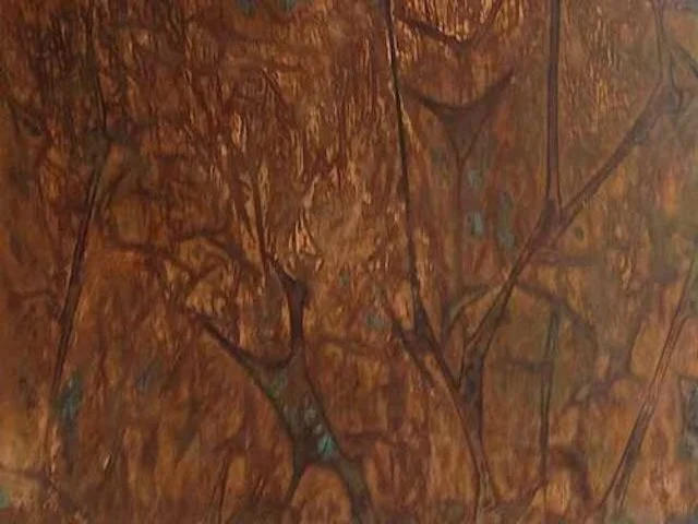
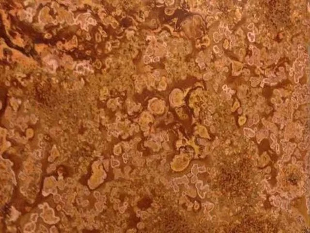
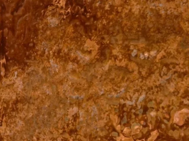
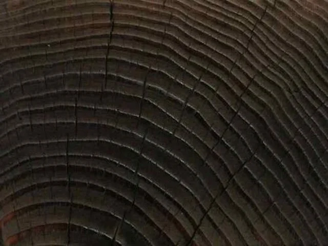
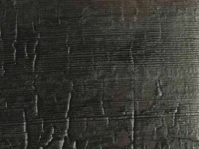
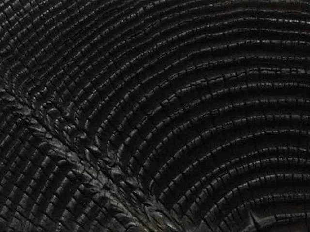
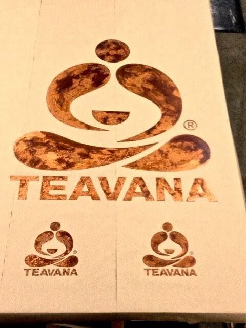
Patinaed Copper Logo and Wordmark on Yukisugi
Client: Americas Concept Design | Starbucks Coffee Company
Project: Teavana Neighborhood Stores | Concepts Design, Development and Prototyping
Duration: 8 Months (Development through production for synchronized flagship launch)
PHASE ONE:
The first commission was for the creation of three-dimensional concept materials to support the first mood and storyboard presentation to company leadership. The scope was to interpret the heart of that presentation and communicate it through copper and wood in a way that would express the feeling, style, and sense of aesthetic direction for on-going design work.
Even though concept materials are created without performance requirements, I always begin by gaining a broad understanding of the potential and limitations of whatever material or materials I may be working with. This allows me to create desired outcomes, that from the onset, are predictable, scalable, and keep the environmental impact of the project to a minimum.
I chose coppers in readily available formats, different in type and temper, and created hammered and low relief textures in each. Given the nature of forced oxidation, many conventional patina solutions and chemicals are toxic and corrosive. And several processes involve complicated procedures that aren’t scalable. These were culled out, and the rest tested across the full complement of copper. Many of these were eliminated as well, and I changed several during the process to achieve specific outcomes. Without a known application, I created concepts that showed full visual and physical variation in several formats.
For a more dynamic presentation than the typical four-inch sample, I sent the copper in assorted sizes, shapes, and gauges to show a range of variation in the patinas and textures. Many hammered pieces were left pleasantly cupped and warped from the pounding. All were sent with edges softened, and surfaces waxed and buffed to a matte or semi-matte luster.
Concerning aesthetics, I meant my interpretations to be nuanced and soulful. I looked to Japanese concepts of subtlety best captured in Shibui, a refined understatement in artistic representation; the cultivated economy and simplicity of Wabi, and the placid beauty of Sabi found when inevitable change and impermanence are shown by naturally occurring wear and patina.
I also wanted to leave traces of how the materials were worked as a way of showing the hand of the human maker, which is integral and appreciated much in the same way intrinsic imperfections and irregularities of the materials themselves are appreciated.
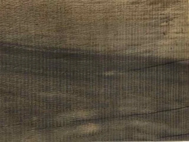
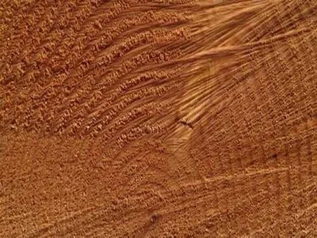
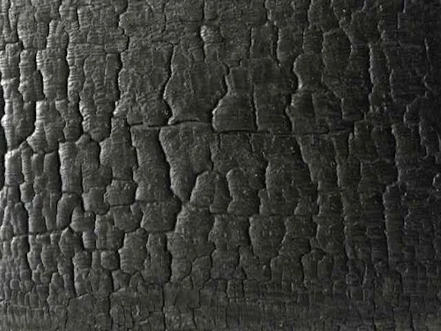
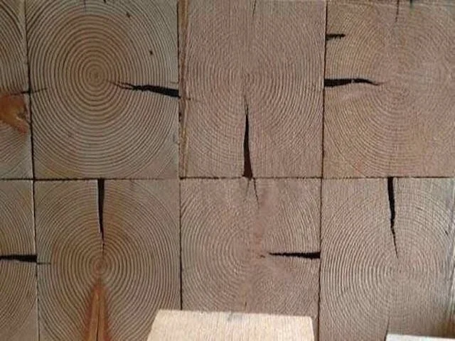
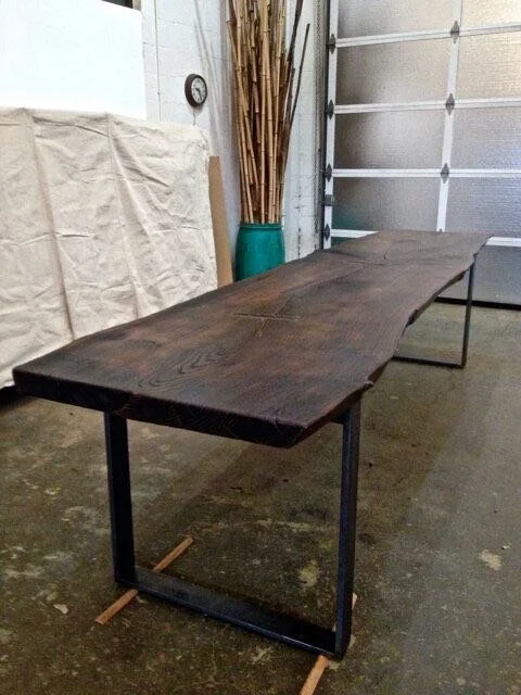
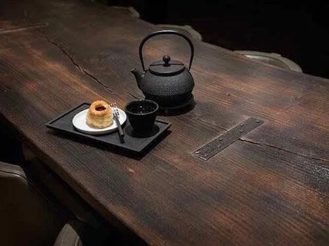
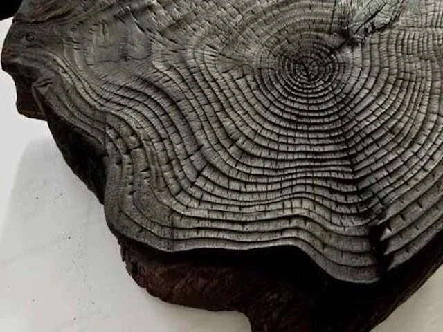
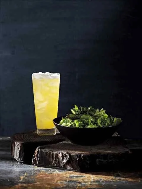
I presented the wood finishes on slices of a salvaged beam and remnant lumber. I left some with evidence of tool marks, and hand-worked others to accentuate the grain and give a sense of having been worn by time and the elements. For coloration, I concocted proprietary bio-based stains, a few infused with black teas. I also introduced Yakisugi to the mix. Authentic Yakisugi (Shou Sugi Ban in the west) is a time-honored Japanese wood cladding made from cypress that is intensely burned as a preservative treatment. I presented it in traditional plank form, and on a full log round. Once burned, I wire brushed each piece, knocking down the charcoal to varying degrees. I then buffed and oiled them to seal and enhance the visual and physical textures.
All of this was meant to make pieces more visually interesting and pleasing. But as important, I wanted to engage the observer’s curiosity. I wanted them to be attracted to the materials, to pick them up, and handle them to experience all the subtle sense expressions.
PHASE TWO:
Eight individual materials were selected by the client for further development. Leases had been signed for four flagship stores that would open within weeks of one another. Once the target dates for the fast-tracked roll-out were set I was able to reserve all remaining openings in the studio production queue to accommodate the schedule.
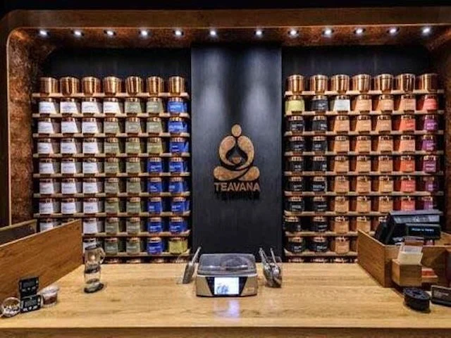
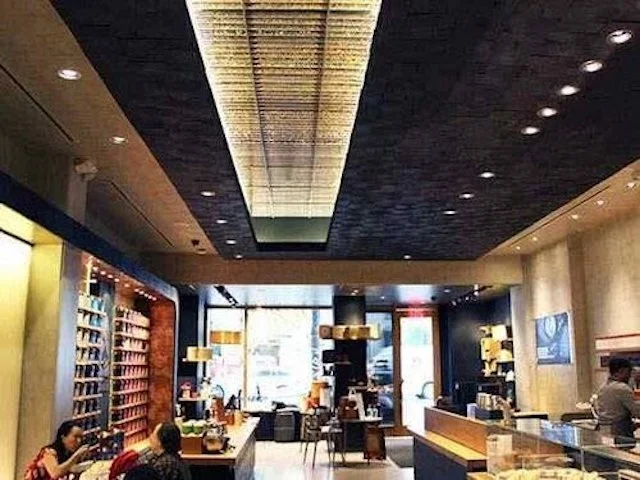
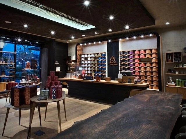
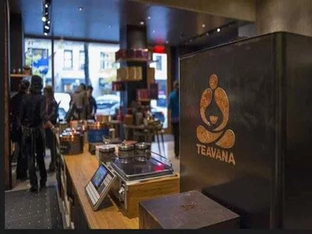
The store design took shape quickly, and as it progressed, I received more commissions to create architectural elements, furnishings, and signage components. The first was for a mock-up of an arched tea display wall that would be the central focal point of all stores. The interior and exterior surfaces of the arched soffit would be clad with the primary patinated copper. At the center, a jet-cut copper logo and wordmark were finished in a second patina. These were installed with standoffs on a shallow bump out of vertical Yakisugi planks.
I suggested a slight change to the arbitrary soffit depth that enabled us to use a thinner gauge, standard roll copper instead of sheet goods. This precluded the need for trimming to width, reducing costs, waste, and production time. This also simplified the shipping of finished goods. I limited sections to twelve feet long so two people could easily handle them without creating unwanted bends or creases.
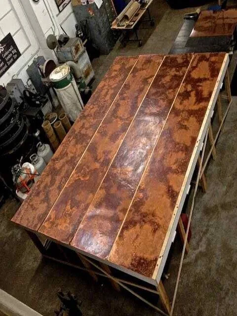
The visual movement of the primary patina was large and organic. So that the pattern would flow uninterrupted along the full width of the soffit, I did the patina work on rolling carts that were butted end to end. This allowed me to bridge the patina application from sheet to sheet preventing a visible break in the natural formations where the sheets would be joined.
Once final designs were green-lighted, our work included five different applications of three first-iteration concept coppers, plus five architecturally predominant applications of Yakisugi, and other charred woods. The one challenge was that each store was in a different stage of build-out, and orders were placed independently by Starbucks, vendors, and contractors for each location. Without coordinated ordering, our ability to combine production for efficiency was practically eliminated. Nonetheless, orders including last-minute add-ons and change orders were filled successfully and all delivered on time.
